Webflow · Custom websites
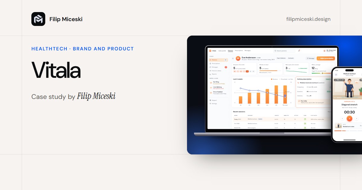
Custom Webflow Builds
Websites for independent clients, designed and built in Webflow since 2022, each with its own layout framework, fast motion and a CMS the client can edit safely.
- Role
- Independent designer and developer
- Users
- Independent clients and their editors
- Made
- 30+ production websites
- Platform
- Webflow, since 2022
Every client wanted a site that looks like nobody else’s, feels fast on a phone and can be edited without breaking.
I design and build each site in Webflow: its own layout framework, CMS shaped like the client publishes, motion tuned for mid-range phones.
30+ production websites since 2022, none of them a reskinned template. Clients edit their own content after launch.
The problem
Thirty-plus independent clients since 2022, and every one of them wanted a site that looks like nobody else’s.
- Asks
- “Does this look like us, and only us?”
- Gets
- A layout framework built for its own goal.
- Asks
- “Does it still feel fast on my phone?”
- Gets
- Motion that stays quick on a mid-range phone.
- Asks
- “Can I change this without breaking it?”
- Gets
- CMS shaped like they publish, and a clean handoff.
My part
I design and build each site myself, from the layout framework to the last interaction, as an independent practice since 2022.
Key decisions
The idea behind every decisionBuilt for one brand, and editable by the client long after launch.
A framework for the brand, not a reskin
Each brand gets a framework built around its goal. Classes are named for what they do, so the next developer can read the build.
- Instead of
- Bending a template to fit
- Chose
- A framework built for each brand
Collections shaped like the client publishes
CMS collections follow how the client publishes: one job per field, so a new entry is a form to fill, not a layout to build.
- Instead of
- Pages built one by one
- Chose
- Collections with one field per job
Same template for all six items
SEO set up before launch, not patched after
Titles, descriptions, heading order and share images are built in, not patched after launch. The panel shows this page’s result.
- Instead of
- SEO patched after launch
- Chose
- Titles, headings and share images built in
Thirty-plus production-ready Webflow websites with bespoke layout frameworks, multi-state animation and clean, documented handoffs. By Filip Miceski.
- Title
63 chars - Description
149 chars - Canonical URL
/case-webflow-builds - Share image
1200 × 630 - Structured data
CreativeWork, Breadcrumb - Headings
One H1 - Sitemap
sitemap.xml
Motion with states, still fast
Multi-state interactions with GSAP and Webflow interactions, tuned to feel alive on a laptop and stay fast on a mid-range phone.
- Instead of
- One-off effects
- Chose
- Multi-state interactions, tuned for mid-range phones
Results
A site can feel alive on a fast laptop and miserable on a mid-range phone. The work is keeping both true.
The handoff is part of the build
Every build ends with a documented handoff. The test: the client edits their content and the layout holds.
- 1Click into the text
- 2Write more, the layout holds
- 3Publish
How success would be measured
- SpeedLoad and response time on a mid-range phone, not only a laptop.
- Client editsContent changes the client makes without asking me.
- Broken layoutsPages that break after a client edit. The framework should keep this at zero.
Not mine: the brands and content, which belong to each client.
About the screens: drawn in HTML to explain the method, with content from this portfolio.